August 28, 2017
[caption id="attachment_21048" align="alignnone" width="1024"] (photo: iStock by Getty Images). [/caption]
Much as sailors use nautical charts to determine their location at sea, economists use charts to show who we are, where we are, and where we might be going.
In the Spring, we began our Chart of the Week feature on the blog: snapshots in time and over time of how economies work to help illuminate the uncharted waters ahead for the global economy.
Here are our top five charts of the week, based on readership:
Chart of the Week: FDI in Financial Centers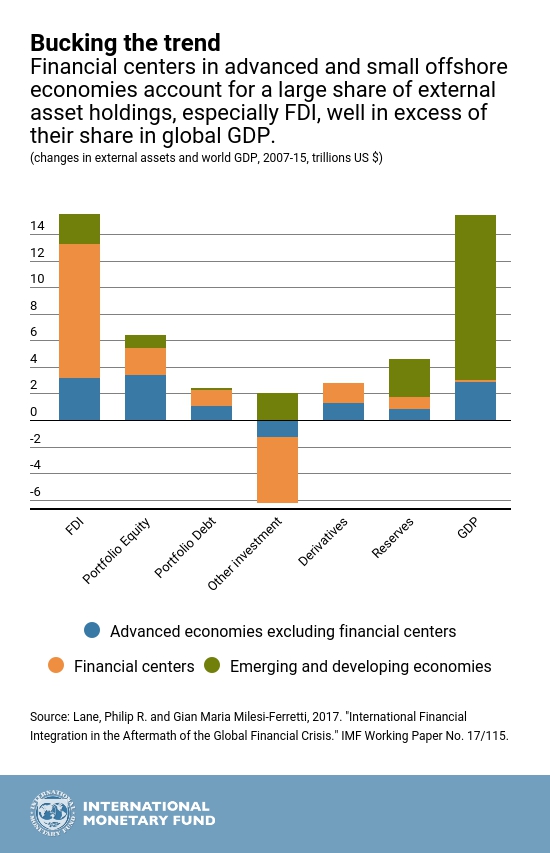
Chart of the Week: Electric Takeover in Transportation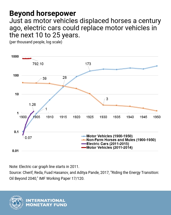
Chart of the Week: Brexit and The City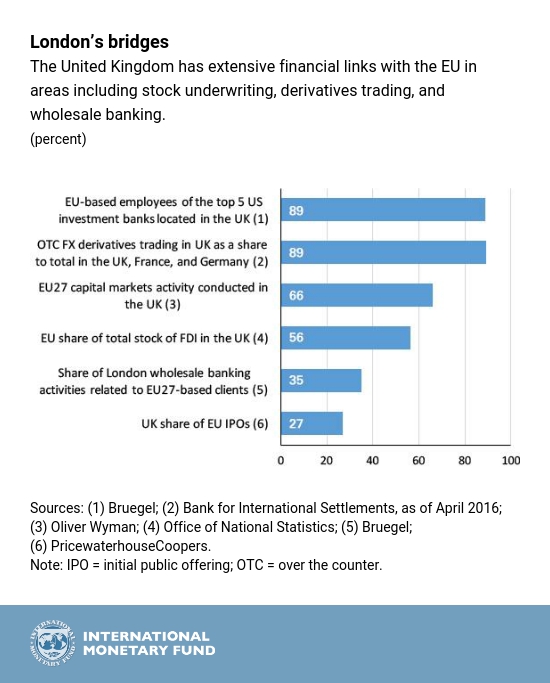
Chart of the Week: Iceland’s Tourism Eruption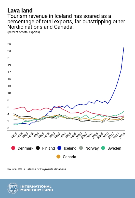
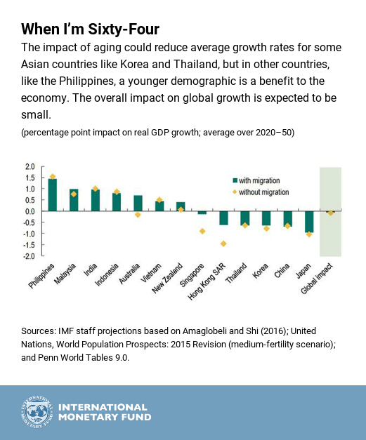
Chart of the Week: The Cost of Asia’s Aging


